The Cai Store Unveils Its Chic New Store at Phoenix Palladium
- 3rd Apr 2024
- 1522
- 0

The Cai Store debuts its revamped identity at Mumbai's bustling Phoenix Palladium, boasting a design philosophy that marries sleek minimalism with vibrant, maximalist touches. Under the visionary guidance of Aashni Kumar, the store transitions from concept to reality, propelled by the imaginative brief from co-founders Aradhana and Dhanraj Minawala. Their ambition was to forge a space that resonates with the brand's core, seamlessly blending its ethos into the physical realm.
The Quintessence of Cai
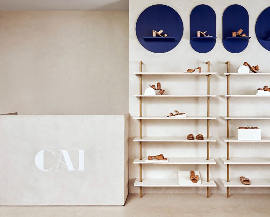
Cai, a label synonymous with an eclectic mix of luxury and comfort, has its unique persona reflected through a design narrative that skillfully balances serene finishes with bold, color-blocked accents—a signature Aashni Kumar stroke. This balance is further accentuated by bespoke visual merchandising areas punctuated by digital screens, echoing the brand's commitment to dynamic and contemporary retail experiences.
Engaging Design at Every Turn
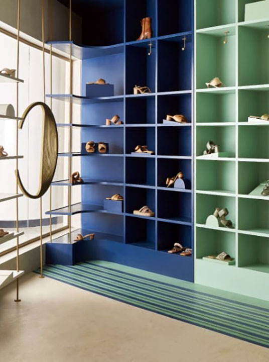
The Cai Store's distinctive 419 sq-ft triangular layout at Palladium engages visitors, offering a meticulously crafted journey through its 38-foot-long entrance façade. Here, seasonal highlights meet the eye in a blue and green showcase to the left, while the right side presents the brand's array of stylish, vibrant, and comfortable footwear, showcased on tastefully understated gold metal and concrete finish racks. A sprawling, intricately designed glass façade, among Aashni's favored elements, weaves a visual narrative that doubles as a showcase and a focal point for visual merchandising.
Harmonizing Spaces with Color and Texture
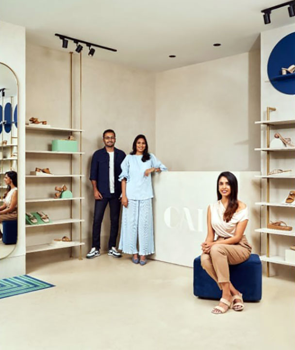
In the realm of design, the store champions a minimalist ethos, punctuated by bursts of color and pattern, creating an immersive retail environment. The triangular space is enveloped in neutral tones that extend from ceiling to floor, crafting an expansive visual field interrupted by strategic color-blocked zones and splashes of the brand's signature colors. This interplay of colors against a monochromatic backdrop is accented by clean, geometric lines, enhancing the visual allure of the space.
The Art of Retail Balance
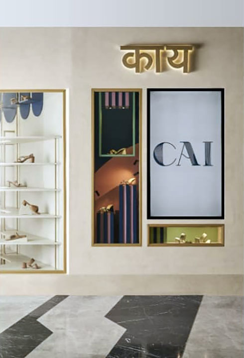
Navigating the delicate balance between product display and spatial economy, Aashni Kumar emphasizes the importance of visual breaks within the store's layout. These strategically placed pauses not only optimize the visual landscape but also elevate the overall atmosphere, directing attention to key elements within the space.
Infusing Warmth and Detail
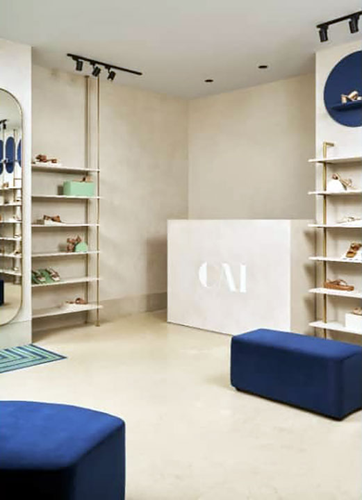
A tactile mix of texture paint and micro-concrete flooring, along with gold metal, mirror, and vibrant finishes, infuse the space with warmth and sophistication. A plush velvet pouffe, organically shaped, sits at the core of the store, inviting interaction. Kumar reflects on the journey from ideation to execution—a formidable challenge amplified by the store's location in one of Mumbai's most frequented malls. The result is a testament to the team's ability to navigate high-pressure scenarios and deliver a retail space that exceeds expectations.
Fact File
- Project Name: The Cai Store
- Location: Mumbai, Maharashtra
- Interior Design Firm and Principal Designer: Aashni Kumar
- Photography Credit: Yadnyesh Joshi
- Styling Credit: Shraddha Nayak
 Namrata Parab


Comments
No comments yet.
Add Your Comment
Thank you, for commenting !!
Your comment is under moderation...
Keep reading luxury post